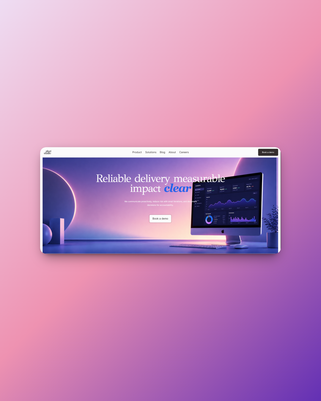
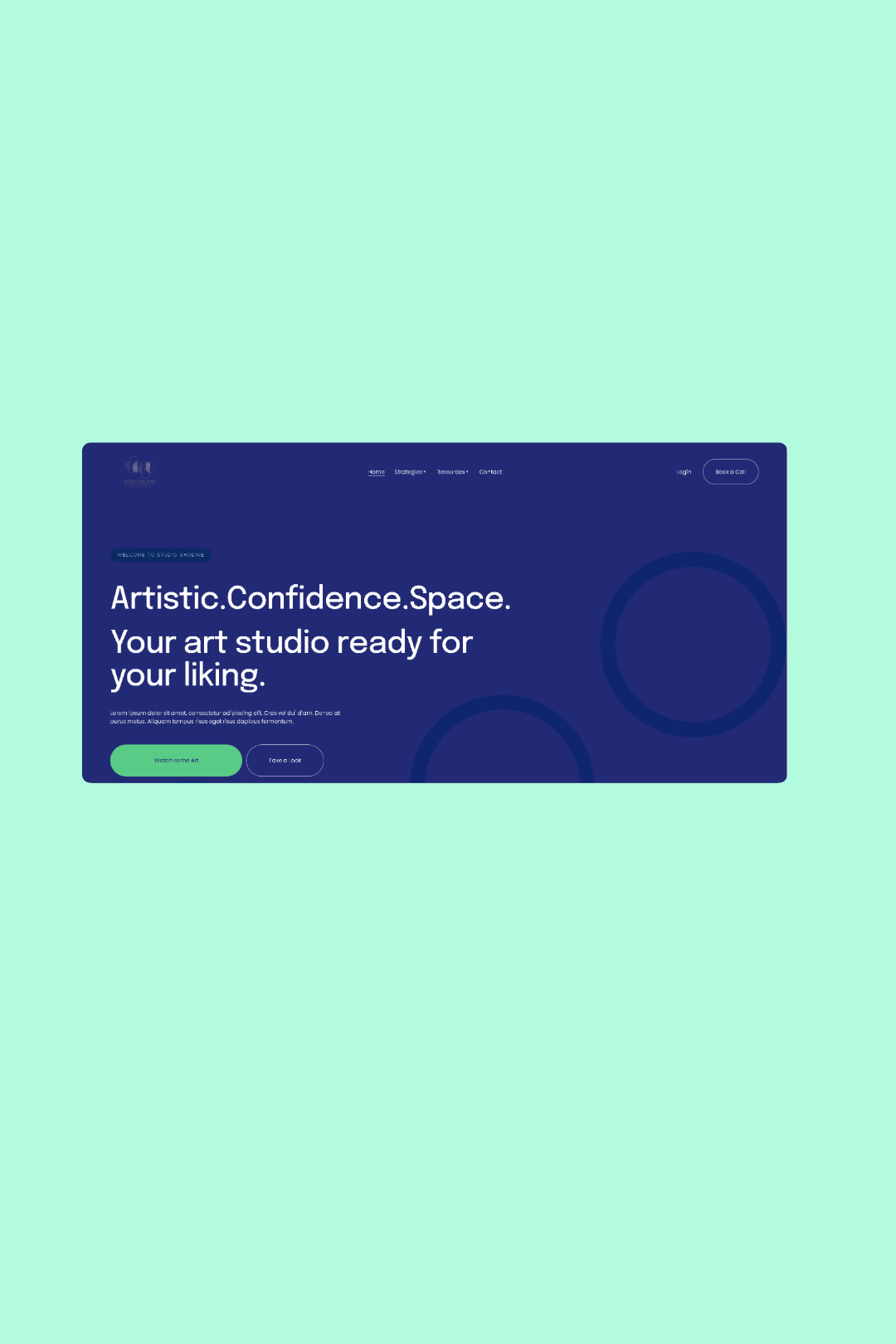
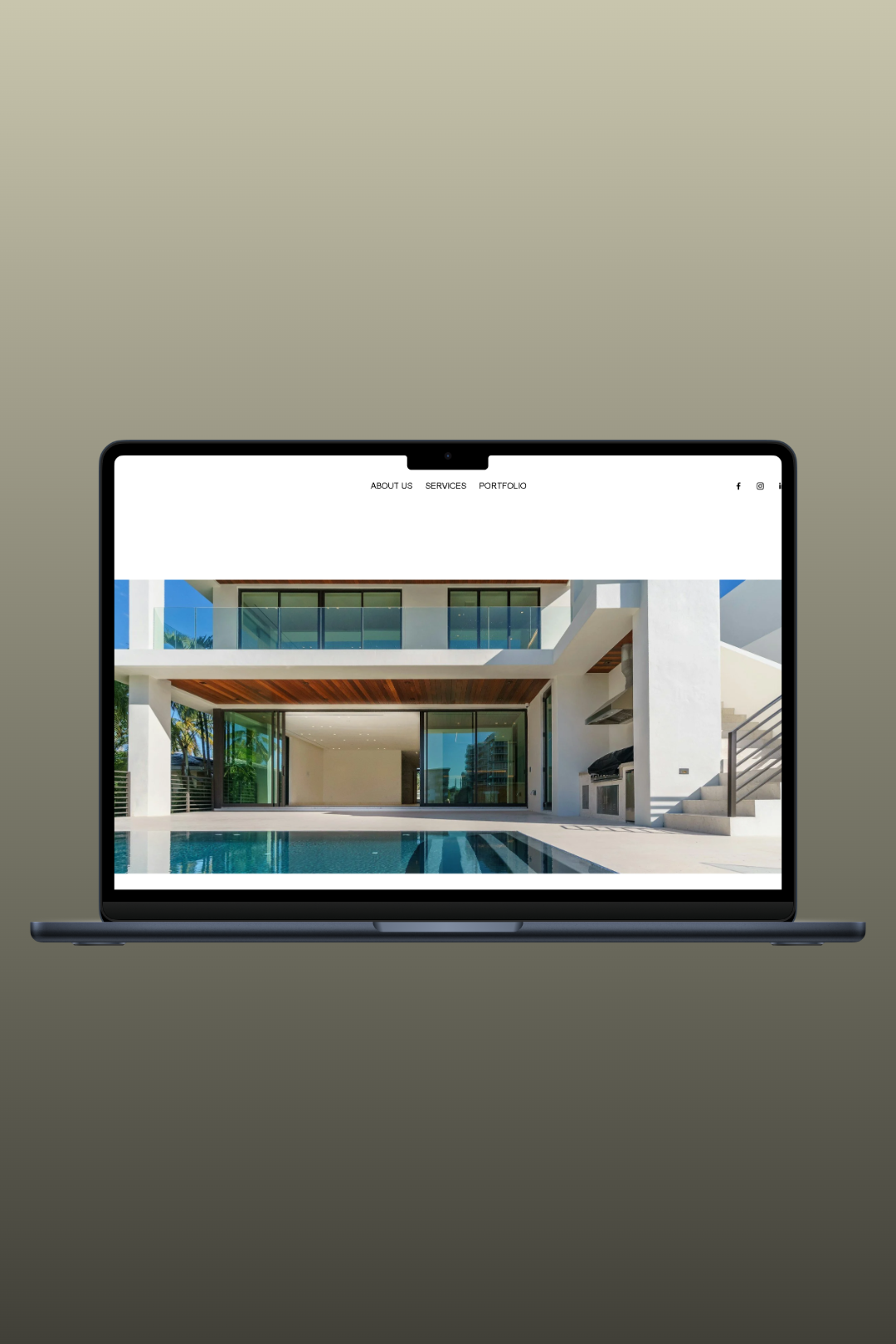
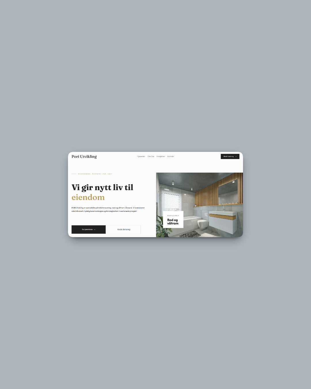
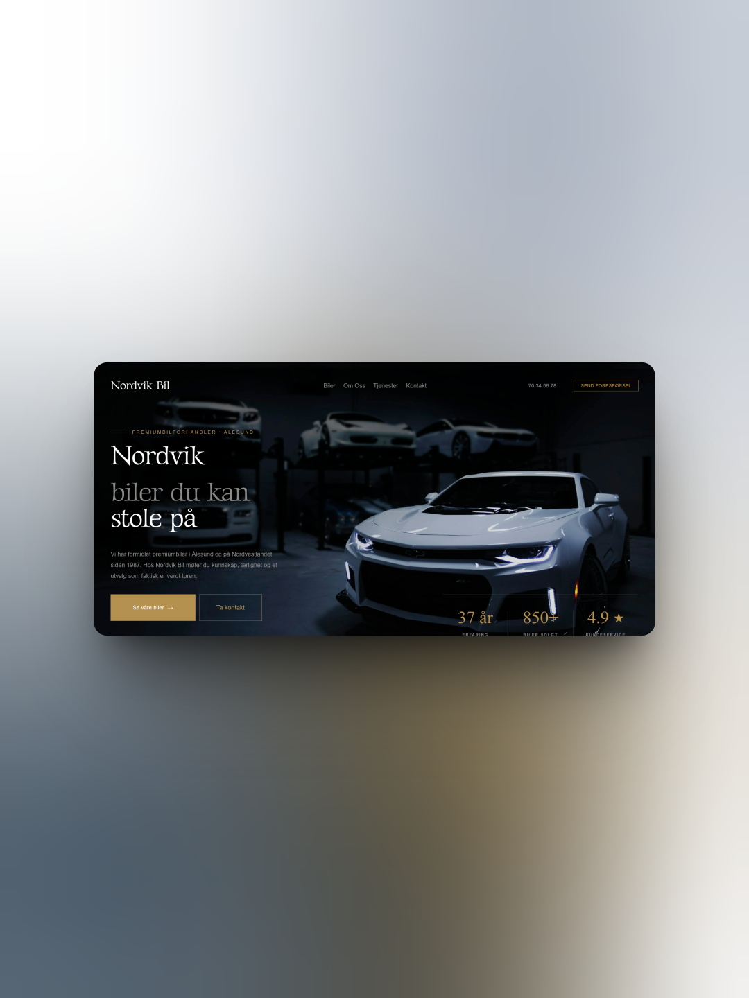
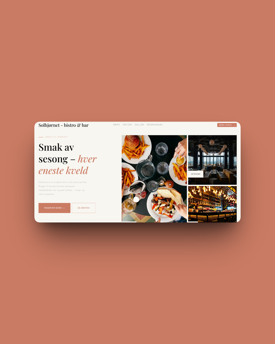
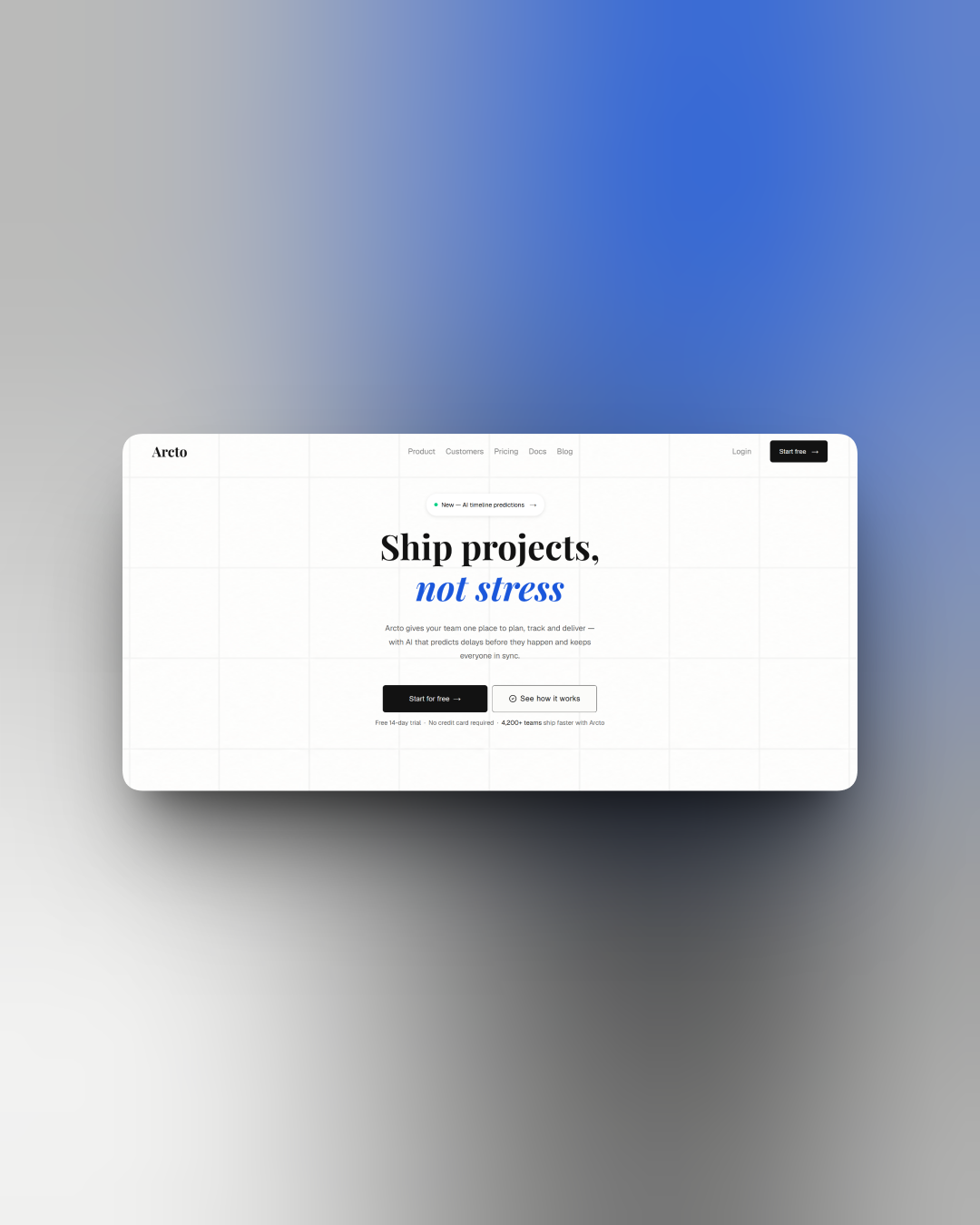
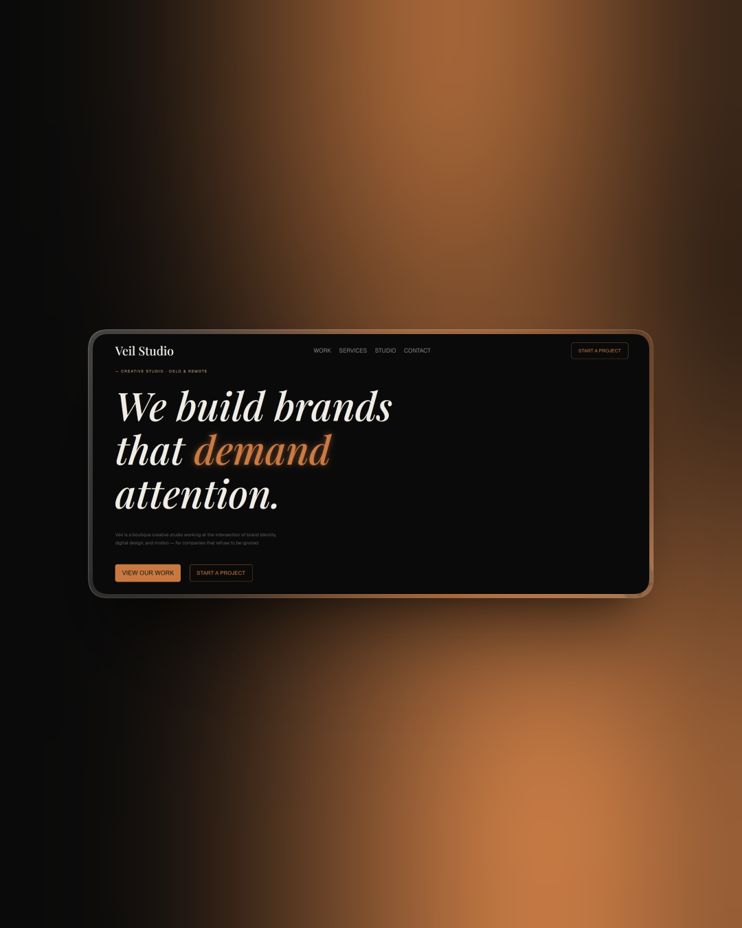
Loop
This website was built for a modern, tech-forward brand that deals with crypto, trading, and stocks. The goal was to keep the design clean, futuristic, and easy to scroll through without distractions.
The homepage starts with a bold message and 3D visuals to give a strong first impression. It quickly breaks down the brand’s focus areas—crypto, trading, and stocks—each with a short intro, so users know what the platform is about right away.
There’s also a “Made for you” section that visually shows what LOOP is offering, followed by clear buttons for things like getting started or reading more. At the bottom, there’s a call to download the app and stay connected.
Overall, the site is built to feel sleek and forward-thinking, without being too complicated. It’s all about keeping it straight to the point while still looking cool.
Aesthetic Ullanueva
This website was built for a travel brand that focuses on personalized trips. The whole vibe is calm, stylish, and made to feel inspiring. Right from the top, it makes it clear: this isn’t just any vacation—it’s tailored to you.
I used soft colors and beautiful images to create that travel mood. The homepage walks you through what the brand does, shows off a few destinations, and gives you options to plan your trip or learn more. Everything is super easy to click through, without feeling overwhelming.
There’s also a section for testimonials and a fun quiz at the end to help visitors figure out where they should travel next. The layout is clean and keeps the focus on photos, because that’s what people connect with most when it comes to travel.
At the bottom, there are links to social and a small gallery that shows even more destinations—keeping it visual and chill from top to bottom.
Rio Saints
This website was made for a modern architecture and construction company. The goal was to keep it clean and professional, while still showing off the houses in a stylish way.
The homepage starts strong with a big image and bold text that explains exactly what they do. Then it highlights why clients should choose them, focusing on trust, accuracy, and expertise.
I also added a portfolio section with images of their custom houses, so visitors can see the different styles right away. The layout is very minimal, making the photos of the houses the main focus.
Finally, there’s a mission statement and a clear way to contact or book a call, so everything feels direct and easy to follow.
Daniel Gallego
This website was built for a jewelry brand that focuses on timeless and elegant pieces. The design is clean and minimal, with a soft color palette that lets the jewelry stand out.
The homepage introduces the brand right away and highlights the main products with big images and short text. There’s also a “Meet the Team” section, which gives the site a personal touch and builds trust.
I included clear sections that explain the services – selling, buying, and trading jewelry – so visitors know exactly what they can do here. Everything is laid out in a simple way, without too much text, making it easy to navigate.
At the bottom, there’s a contact form and a sign-up option so people can easily reach out or stay updated.
Studio Shodwe
This website is made for an art studio that’s meant to feel open and welcoming. The front page makes it clear that this is a place where artists can show and sell their work.
I divided the site into sections so it’s easy to follow: first there’s a big intro focusing on art and identity. Then it shows different styles (modern, colorful, black & white) so visitors can see the variety. There are also pictures of artists to make the page feel more personal and trustworthy.
Next, the site explains what the studio can help with – like selling art, keeping ownership, and getting more value out of your work. Everything is explained in a simple and clear way, without too much complicated language.
At the bottom there’s space for contact and a newsletter sign-up, so people can easily get in touch or follow along.
Finity Running
This website was designed for a running-focused brand with a chill, sporty vibe. It’s meant to attract runners of all levels – whether you're training for a 10K or prepping for a full marathon.
Right away, you're met with bold, high-energy visuals and a modern color gradient. The brand name pops with a slight twist of personality (check the underlined Running.) and the gallery-style images below show movement, energy, and variety.
The contact section is kept simple with a clean form and a map showing where they’re located – easy to reach out, no fuss.
Scrolling down, users can check out what’s offered:
10K, Half Marathon, and Marathon plans – each with a button that’s straightforward and ready to go.
At the bottom, there’s a quote for motivation and a quick subscription box for tips, deals, and news. Nothing too pushy, just helpful.
Overall, the site is bold but friendly – it feels like a mix between a runner’s journal and a community you want to be part of.
Start your project
If you’re ready to take your website to the next level or have any questions about how I can help, feel free to reach out. You can contact me via the contact form or through Behance, Dribble, LinkedIn or Mail.