
How to change the mobile view on Squarespace.
How to Change the Mobile View in Squarespace
Want to see how your site looks on a phone and make layout tweaks? Squarespace makes it easy to preview and adjust the mobile version of your site. Here’s how to do it step-by-step:
1. Open the Page Editor
Log in to your Squarespace account and go to the site you want to work on. In the left-hand menu, click on Pages, then choose the page you want to edit (e.g., "Home").
Click the Edit button at the top of the page preview to enter editing mode.
2. Switch to Mobile View
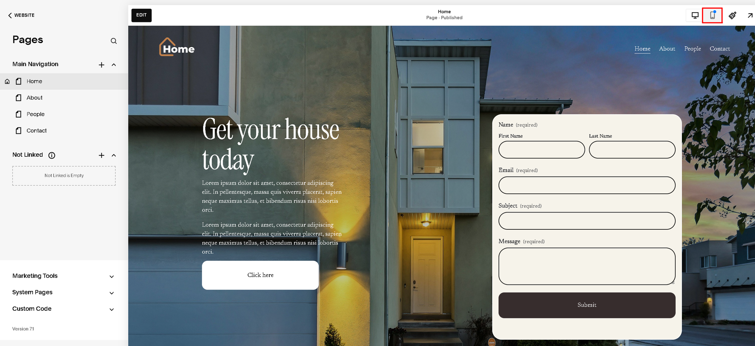
At the top-right corner of the screen, find the Device View icons. These let you toggle between desktop, tablet, and mobile previews.
Click the mobile icon (the smartphone symbol), as shown in the red box in your image. This switches your site preview to mobile mode.
3. Make Mobile-Friendly Adjustments
Once in mobile view, you can:
Preview how elements respond to small screens.
Adjust padding or spacing of sections using the site styles panel (click the paintbrush icon).
Resize text and buttons so they don’t look too big or too small on phones.
Check your navigation menu to make sure it collapses into a clean hamburger menu.
Edit image and form layouts so they stack well on narrow screens.